Smart, Simple, Sexy – What Makes Message Mate So Effective?
You can choose other texting solutions, you can add live chat to your site, you can even add the Facebook “message us” button. None of those will give you the value Message Mate does.
There are a host of reasons related to the back-end features of Message Mate: auto replies, templates, ratings, review requests, list building, bots, and more… but this post will be about the front end.
Every aspect of the widget has been designed, tested, and tweaked with customer engagement in mind. You wouldn’t know it by just looking at the widget but there’s more than meets the eye. This post lets you peek under the hood and understand the design principles behind it.
- Subtle Persistence (desktop and mobile)
The widget is available for customers but doesn’t get in their way. On desktop the handle is tucked into the right hand side and on mobile it’s an elegant handle bar at the bottom. The handle follows customers and stay in the same place as they browse so they are just a click away and always know exactly where to find it.
- Says hello, I’m here for you (desktop)
When a customer first visits, the widget pops out for a few seconds to announce itself and say hello. It does not take over the page and the customer can still scroll, click, and keep doing whatever else they were doing. This is intended to educate customers: 1. We are here for you. We are a brand that cares. 2. Don’t go looking for contact info somewhere on the site (because you’re more likely to bounce then). This is how to reach out. Just click here.
The timing of when the widget extends is optimized based on when someone is most likely to need to know about the help option.
On mobile, The widget does not fully auto-extend on mobile screens, because that would overwhelm and distract from the current browsing experience.Instead the handle becomes visible once the customer starts scrolling.
- Size and placement (desktop)
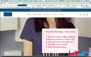
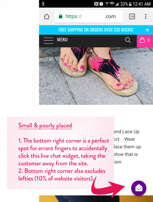
The size of Message Mate is optimized by platform. On desktop it’s a size and placement that’s easy to click on. When a website visitor goes to the edge of the side of the site, they can’t miss clicking on the handle. Solutions that have a small circle with space around it or a floating button like Messenger are harder to click on and can easily be missed.
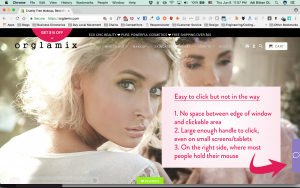
If you think this isn’t important, keep in mind the human attention span is about 3 seconds. If the customer has to make too much effort to click, some notification or other distraction can woo them away in an instant.
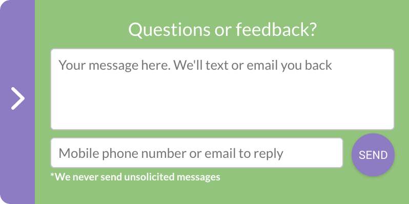
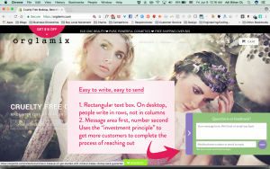
Once you open Message Mate, the size and shape of the field are meant to make it easy for people to write a note. The rectangular shape is more in line with how people write (for example on FB) – in rows and not in columns like many live chat apps are designed.
- Field order (desktop)
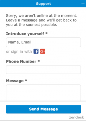
The area for the message comes first. In many live chat apps the customer is asked to provide contact info before being able to write their message (when the business is offline). This is meant to counteract a very big disadvantage of live chat – that the business does not get the customer’s contact info unless the customer actively input it in. This order deters some customers from continuing; Some don’t want to share their email, some get stuck deciding which email to give you (the real one or the spam one?), some want to chat now, and some just get distracted.
With Message Mate we are thinking about the customer’s needs first; The customer has a question and they need to get it off their chest. Do not bother them with a request for something else before they took care of their need.
But this does not just serve the customer, this serves the business as well. This is because of the “investment principle“: Once the customer has already invested in writing their message, they are more likely to complete the process by providing their contact information. This means more customers complete the process and actually reach out.
- Size (mobile)
Sizing in mobile is tricky. The screen is so small and competition for every pixel is fierce.
Again we place the handle at an edge so that all the customer has to do is slide all the way down. They do not have to get their finger placement to be perfect on some round floating circle or rectangle.
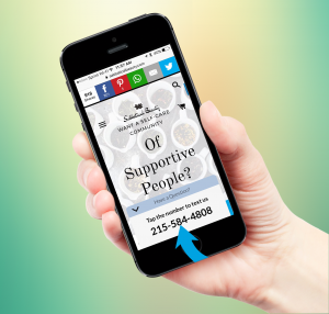
Once opened on any mobile phone, the Message Mate widget is placed such that clicking the number is exactly where the thumb would normally be. You can’t miss it.
- Colors.
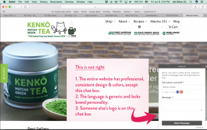
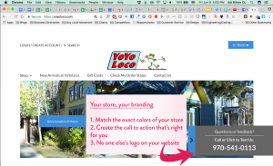
Every element on a website has to look like it belongs there. Boxes with generic colors, or worse, other provider’s colors, look out of place and down right ugly. We can’t believe some live chat apps do not let you customize the colors of your box or only let you customize a few small aspects. One of our main criticisms of the FB “message us” button is how it sticks out like a sore thumb. It’s not in line with the brand and it’s taking away customer focus which should be on your brand and products.
Our widget can be any color and stores are able to input the exact color code of their brand for complete consistency.

- Text
Similar to colors, the copy on a website reflects the personality and style of your brand. This should permeate through every single interaction with customers, especially on the ‘contact us’ widget that addresses them directly. Most live chat apps and certainly FB Messenger do not let websites customize the copy. WRONG. We built Message Mate with brand personality in mind. You can customize the text based on your goals (“ask us anything”, “get a quote”, “Need makeup advice” etc.). The only constraint is the character limit and your creativity.

- No logo
In the same vein as our philosophy about Message Mate reflecting your brand, we do not place our logo on the widget like many live chat apps do, even though it would certainly be better for our sales. This is your store. No one else’s logo should distract from that – No live chat app and certainly not Facebook.
Live chat forces you off brand in color, language, and logo.
Message Mate
Use your colors, your call to action, your logo
- In site
Both on desktop and in mobile the widget stays in the website experience. It does not open a new web window like some live chat apps. This is because opening a new web window is an invitation for the customer to bounce. A slow internet connection, a Facebook notification – anything can distract the customer away. Remembering that online, every millisecond matters, keeping customers in your website reduces the chance of bouncing and increases the chance that even if they get distracted customers will come back to the same open browser window and complete their purchase.
This is why in desktop Message Mate opens inside your website. On mobile, clicking on Message Mate opens the customer’s texting app because that is the fastest way to get them to send their message (customer doesn’t have to input their number manually nor remember your number). When they’re done, the customer can go back to their browser and be in the same exact place they left off.
Example Messenger App Behavior on Desktop. Opens a new tab, even if the customer is already logged into Facebook. Sometimes, they are asked to sign in as well.
Example Message Mate Behavior on Desktop.
- Always on
Message Mate is always on. It never disappoints the customer by telling them the store is offline. As a result, more customers reach out and stores can convert them. Texting is an asynchronous medium meaning it can, but it doesn’t have to be, immediate. With the auto reply feature, customers are aware that they won’t get a reply immediately and that’s acceptable. At that point they have already sent their message; You can get back to them and save that sale.
In contrast, live chat is supposed to always be immediate. What a conversion killer it is when live chat boxes tell customers that no one is available to answer them. Most customers simply delay their purchase for later and later may never come.
Most people ditch when you tell them to “leave a message”, especially if they have to fill out three fields.
Most people send a message if they can text you whether you’re online or not.
Your auto reply sets expectations about when a reply will arrive. While a faster reply is better, according to our data, as long as customers get a reply within the time estimate, customer satisfaction scores remain incredibly high when using the texting channel: 75% scores of 8 or higher (on a 0-10 scale).

- Flexibility.
Message Mate is optimized based on everyone’s data but we recognize each store is unique and might have its own needs. We continuously add customizations to enhance customer experience that is personalized for your customers.
Current customizable features include:
- Place widget left or right (desktop)
- Change when/if widget pops out
- Change what pages widget pops out
- Have widget appear on mobile only, desktop only, or never appear
- Move widget up or down the page (desktop)
- Reduce width of widget by up to 50% (mobile)

Need more? Check out this case study summary
Ready to go? Get Message Mate for your Shopify store now/?utm_source=Blog&utm_content=Message_Mate_Under_Hood”.
For other platforms (Big Commerce, Weebly, Magento etc.) click here.
Questions? Text us at 650-825-1166